Design Your Social Media Images to Promote Your Brand
Are you posting images across your social media pages?
Do you use these images to extend your brand recognition?
Using images on your social media pages is a sure way to engage your audience. In addition, the way you use logos, fonts and colors in your social media images is an important part of gaining brand attention.
In this article you’ll discover how to make your social profiles and visual content reinforce your brand and catch your audience’s eye.
Choose Your Fonts and Colors for Effect
The primary visual elements that create people’s perception of your brand on social media are fonts, colors and images. Your different goals may require different choices for each element.
The fonts available range from bold and loud to thin and delicate. Where does your company persona fit on this spectrum?
For the majority of your marketing, you should limit yourself to two or three main fonts. It’s acceptable to occasionally break that rule on social media.
Using creative fonts in your Facebook updates, Havaianas match their print theme and reflect the company’s fun and playful identity.

Choosing images and colors for your visual updates, you need to consider what feelings you want to evoke.
For example, if you are promoting a contest? Use bright, cheerful colors. Are you posting a staff update? You should use a well-lit portrait and include it in a design with your brand colors.
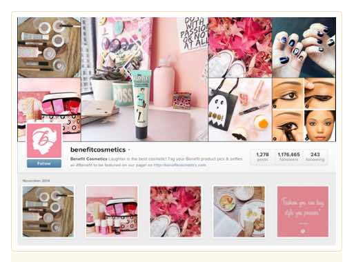
Beauty brand Benefit Cosmetics does a good job of reflecting their feminine identity on Instagram. Note the pink and white palette, simple imagery and use of a playful script font.
Design Reusable Templates
Each social media network has its own optimized image dimensions. It can be time-consuming to create individual images for each network every time you want to share visual content. Even creating a single image to share across all platforms can take more time than you’d like.
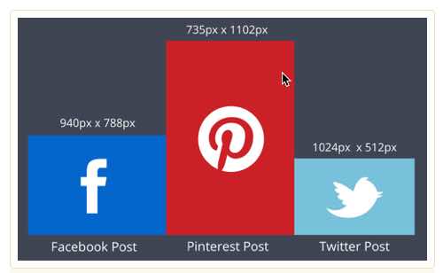
The easiest way to reduce your design time and maintain consistency is to create templates for the types of posts you share regularly. Don’t restrict yourself to one or two types of templates—make several to accommodate a variety of content. Here are some additional template ideas for weekly posts:
- Product Tips
- Event Posts
- Company Milestones
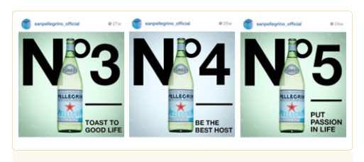
In the example below San Pellegrino posted a sequence of 10 tips on Instagram. Their simple template made the tips easy to create and instantly recognizable to their audience.
Create Complementary Profiles and Covers
Consistency is a key part of recognition and success. Use your company’s logo or a variation of its design for each of your social profile pictures to build your online brand recognition.
Even if you tweak your logo, your audience should still be able to recognize you immediately.
Havaianas experiments with fonts in their Facebook designs.
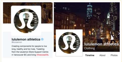
In the example above you can see how lululemon athletica has adapted a version of its standard red logo to match its cover image on Facebook and Twitter.
The harmony between your profile and cover photos is anchored by graphic elements such as color, text and imagery. Create a cover photo that complements your profile image. You can use existing marketing materials or create something new.
If you create a custom cover image and want to ensure that the colors match your profile picture, use a color picker tool to extract the color hex code. A hex code is a six-digit code that represents an exact color universally recognized by HTML and CSS.
When you know your hex codes, you can use the same colors in your designs over and over again. This removes any variation or guesswork and provides for a consistent look.
Use Watermarks Consistently
If you include a logo or other icon with your images, you should create guidelines addressing your logo size and placement. Doing this avoids appearing sloppy by having inconsistent logo sizes or random logo placement.
In the picture below you can see that the H&M logo is the same size and in the same place on each photo. Being consistent plays a part in their overall brand recognition.

A quick tip: Don’t place your logo flush with the edge of your photo. Instead, leave some space around it to make it neater and look more intentional.
Let Your Image Do the Talking
Up to 90% of the information transmitted to your brain is visual, so it’s no surprise that people respond well to great visual design.
Using pictures as the focus of your updatesgives you a great opportunity to be creative. When you design your visual content, rely less on your words. Let your colors, images and backgrounds convey your message.
In the picture below notice how the compelling background image and Twitter icon grab your attention first and work well with the more subtle text call to action.
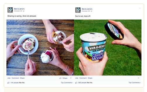
When you have the perfect picture, sometimes you don’t need to use text overlays at all. Use clever images to capture your audience’s attention. In the image below, Ben and Jerry’s used fewer than 10 words in their updates. They let their product pictures do their talking.
Over to You
With over two billion people active on social media every day, improving how you use visual assets is a powerful way to drive more people to your business.
Use consistent fonts and colors and your existing branding to extend your recognition beyond the usual places. No matter where you post, make sure your audience can recognize you immediately.
Make the most of your visual assets and enjoy creating beautiful designs. The social media race is on, and responsive and engaging design is your express ticket to the finish line.
What do you think? Have you used any of these tips already? Do you have additional ideas to share? Leave your comments and questions below.

