11 Steps to Receiving Better Customer Feedback *

11 Steps to Receiving Better Customer Feedback *

Would You Like to Improve Your Feedback?


There’s an old adage that “You can’t fix what you don’t know about”.

In the digital age, customer feedback is more important than ever.  It’s exciting to see so many companies do post-purchase customer surveys.  However, it truly amazes me how many businesses don’t bother to do any customer surveys.

Many of the customer feedback collection methods rely on the Net Promoter Score system.  This ia a simple zero to 10 scale that asks the customer how likely they are to recommend the business to a friend or colleague.

NPS was developed by Fred Reichheld, and is often referred to as “The Ultimate Question.”  NPS has been widely adopted with more than two thirds of Fortune 1000 companies using this method to survey their customers.


The Net Promoter Score divides survey respondents into promoters, passive and detracters

It’s easy to calculate your Net Promoter Score from any survey you do.  All yo do is subtract the percentage of Detractors from the percentage of Promoters.  The calculation is that simple.  If 50% of your respondents were Promoters and 10% were Detractors, your Net Promoter Score is 40.

The importance of the Net Promoter Score is that it gives you insights into your customer loyalty spectrum.  As you move up the scoring scale, from 0 to 10, customers defect at lower rates, will spend more and will move from negative word of mouth to positive.

By measuring your customer loyalty you can identify customer experience weak points that need to be improved.  However, to do this you need to know how to conduct Net Promoter Surveys.  As the Net Promoter Score’s strength isn’t it’s ability to measure customer loyalty, but it is how easy it is to measure loyalty, which is crucial.


Net Promotor Score Analysis garphic by Relently

We all get NPS surveys in our email.  I recently was sent two NPS queries in a 24-hour span, by two very different companies.  Even though they are asking the exact same question, how they ask is very different.    Comparing how they asked made me think about the best ways to design my future questions.

Listed below are 11 ways I think you can improve the Net Promoter Score surveys that you send.  But first, lets look at two NPS surveys that handle their questions very differently:


MGM Grand Net Promoter Score Survey


I recently visited the MGM Grand for a conference, and received this feedback request 48 hours after checkout:

From: MGM Grand <mgmresorts@express.medallia.com> (note: Medallia is a third-party research firm that handles many NPS surveys for brands)

Subject: Tell Us About Your Stay at MGM Grand


The MGM Grand Hotel in Las Vegas Nevada

I suspect Medallia has done subject line testing on these NPS emails.  However, but I don’t personally love the subject line here, “Tell Us.”  It feels like a command, and lacks warmth and empathy.

Other observations:

  1. They did a good job of personalization.
  2. It’s a clear statement of the actual question.
  3. Ability to provide feedback in Spanish is a nice touch here, rarely seen.
  4. Humanize the organization by mentioned the person in charge of feedback collection.
  5. I do not understand why this sea of logos is included here.  We know MGM Grand is where I stayed.  However, it is not relevant in this interaction to collect feedback.  Reminding me of all the properties in their portfolio, the name of their rewards program, etc. is a waste of space, and robs attention from the reason for the email.
  6. I appreciate the inclusion of an opt-out mechanism in the footer of their email.


The worst sin their email committs, it’s not mobile-friendly.  This survey on my iPhone, required a side-scroll to participate.  The survey itself would be very easy to make work in mobile.  The spacing required putting on a sea of logos creates the problem!

Anything that you want to receive a response to must be kept as simple as possible.  The K.I.S.S. principle really does work.


More of your customers are using mobile as their primary or only email access point.

This is certainly an issue, as more and more customers are using mobile devices as their primary or only email access point.

Also of interest is the reminder email that MGM Grand sends out two days later to people who have not yet participated in the NPS survey.  This email has the same subject line with the addition of “Reminder:”, similar body copy, but a more compact footer.

It’s still not mobile-friendly.  It appears that perhaps the flaw lies with the email templates used for the initial NPS appeal, rather than the reminder.  I feel that this second email should have a completely different tone, message, and subject line.  

If you didn’t participate the first time, it’s probably not because you forgot and need a “reminder.”  Their second email “reminder” reminded me how my six year-old grandson can stay on message when he wants a snack because he’s hungry 10 minutes before we serve dinner.  

The reason you didn’t respond was because you chose not to do so.  A better strategy would be to change your approach and message in any follow-up email.


ClusterTruck Net Promoter Score Survey


ClusterTruck is a mobile restaurant and food delivery service with locations in Indianapolis, Bloomington, with several more cities on the way.  My wife received this NPS survey from Clustertruck the morning after food delivery.  

From: Chef Tim <customerservice@clustertruck.com>

Subject: Alyson, how was your ClusterTruck?

I love the personalization and humanity right up front on this one. The email is “from” the Chef, not the company.  Terrific!  Plus, using first name personalization in the subject line itself is a smart move that typically increases open rate.


ClusterTruck is a mobile restaurant and food delivery service with several locations

Other observations:

  1. Outstanding addition to the personalization and humanization by using photo of the real Chef Tim (presumably).
  2. Excellent emphasis that this feedback is ACTUALLY READ by a real person.
  3. I do not like the vagueness of the query here. “How did we do?” followed by a NPS scale is not confusing necessarily, but is too imprecise.
  4. Terrific reminder of what items were ordered.
  5. While not particularly offensive, inclusion of social media logos in the footer is perhaps superfluous, especially without a request to follow on those platforms.
  6. No opt-out available, which is a problem, and perhaps a violation of CAN-SPAM regulations.

The Clustertruck email renders perfectly on a mobile device.


The Post-Click Experience


Upon clicking somewhere on the zero to 10 scale, both emails take you to a web page.  The MGM Net Promoter Score survey asks you for a reason why you gave the score you did, and then takes you to the front end of a VERY long survey.  

It’s largely a marketing wolf in market research clothing.  The MGM Grand comes across as being full of themselves.  It’s as if they are telling us, “you’re lucky we let you stay in our hotel, now sit down and answer our damn questions.”  That doesn’t give me a warm and fuzzy feeling.

However, ClusterTruck handles their survey very differently.  After picking a score on the ClusterTruck email, participants go to a web page where you are asked to provide commentary.  After submitting some, you are asked to rate ClusterTruck on Facebook.  The survey then concludes.  ClusterTruck understands the K.I.S.S. principle.

Which approach would be more likely to get your response?  

Which survey would get the better response from you?


How You Can Improve Your NPS Surveys


What have we learned, and what are the recommended elements of good NPS surveys:

  1. Ask in your subject line; don’t command.
  2. Personalize wherever possible, including the subject line.
  3. Humanize wherever possible, including in the “from” line. Also, add a photo of a company representative.
  4. Make clear that one or more real people will be reading these responses if that’s the case.
  5. Provide an easy way for customers to participate in other languages.
  6. Make the NPS survey email mobile-friendly.
  7. Remind customers what they ordered or purchased.
  8. Don’t clutter the email with icons, logos, or other unnecessary visuals.
  9. Provide an opt-out mechanism.
  10. If you send a second email to non-participants, change your approach.
  11. Make their post-click experience simple and straightforward.


How You Can Make Your Content Amazing by Analyzing It *

How You Can Make Your Content Amazing by Analyzing It *

We All Feel That Our Content Matters


As we write our Blog posts, articles and other web content we do so with one thing in the back of our minds.  Admit it, we all worry because everything we produce will be ranked by GOOGLE!  Whether our content lives or dies depends entirely on how Google ranks our content.


Google’s Analysis Begins With Our Headline


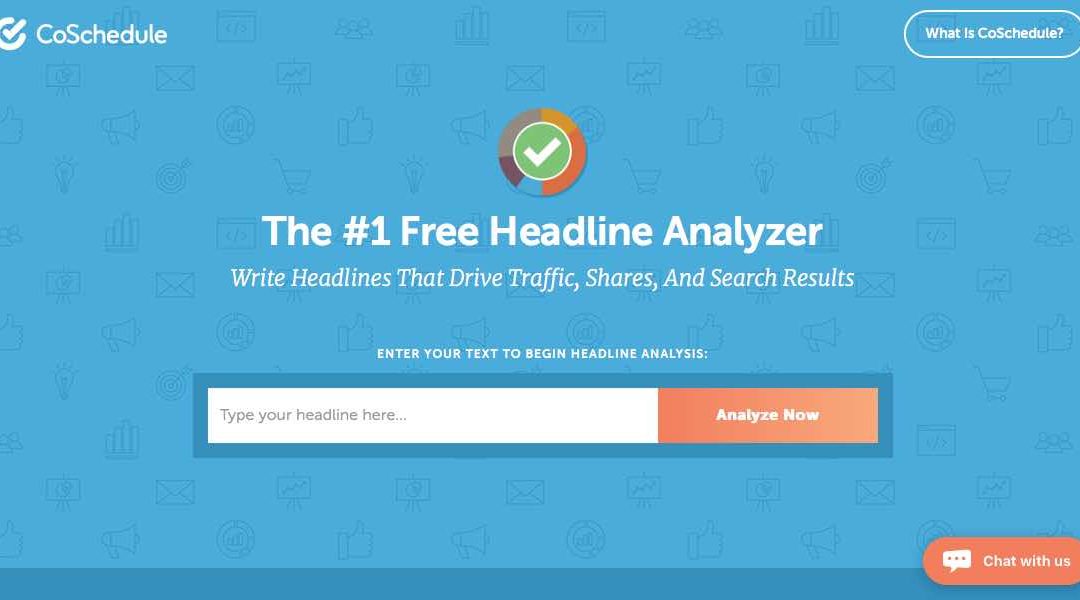
My headline for this article, “How You Can Make Your Content Amazing by Analyzing It” suffered through several versions before I felt it was good enough to publish.  By the way, my headline scores an 80 when I tested it in CoSchedule’s Free Headline Analyzer.


CoSchedule's Free Headline Analyzer Gives your title a numerical score

CoSchedule’s Word Balance gives an analysis of your headlines structure, grammar, and readability.


The Free Headline Analyzer Does so Much More


If all CoSchedule’s Free Headline Analyzer did was give you a score it would be a great free tool.  But it does so much more than that.  It also analyzes the words that you choose and breaks them down under what it calls Word Balance.


CoSchedule's Free Title Analyzer gives a Word Balance score

Coschedule’s Word Balance breaks your words down into four groups.  These groups are common words, uncommon words, emotional words and power words.  It also gives each group a percentage that it composes of the headline.


How Does Word Balance Help You?


What Word Balance gives you is a breakdown of the words in your headline and what group they belong to.  It tells you how many common, uncommon, emotional and power words are in your headline.  However it goes beyond that by giving each group a percentage.


CoSchedule's Word Balance breaks words into four groups

In our headline, “How to Make Your Content Amazing by Analyzing It” the breakdown of the words into their groups is:

  • Common (33%) – by, how, it, to your.
  • Uncommon (0%) – make.
  • Emotional (33%) – how to make.
  • Power (11%) – amazing.

The free headline tool does so much more for you…..


CoSchedule’s Free Headline Analyzer Does More  

The Free Headline Analyzer Also Does a Length Analysis


CoSchedule’s Free Headline Analyzer’s Length Analysis provides an analysis of the overall structure, grammar, and readability of your headline.


CoSchedule's Free Headline Analyzer also does a length analysis

Your headline is the right length:

  • Your headline is 48 characters, headlines 55 characters long or less tend to earn the highest number of click-throughs.
  • Your headline is 9 words, headlines with about 6 words tend to earn the highest number of click-throughs.


Your Headline Needs to be Skimmable


When skimming an article’s content, most readers tend to read the first and last three words of a headline. 


Your Headline needs to be skimmable

Your headlines should include searchable keywords

Your headlines should include searchable keywords and phrases so that readers can find your content easily in their search queries.  In this case the analyzer has determined that the searchable keyword in the title is content.


The Analyzer Also Determines Your Headline Sentiment

Our headline, “How to Make Your Content Amazing by Analyzing It” expresses a positive sentiment.  Headlines that convey positive emotion tend to perform the best.

Your Google Search Preview


CoSchedule’s Free Headline Analyzer also previews the appearance of your Google Search and your Google Featured Snippet Box.


The Title Analyzer shows your Google Search Preview

The Analyzer Provides Your Email Subject Line Preview


This is what your headline will look like as an email subject line.  The optimal reading length is around 20 characters.


The Analyzer Provides Your Email Subject Line Preview

The Analyzer Can Do Even More


I use the free CoSchedule Free Title Analyzer to also give me information about sentences I write in my content.  Enter any sentence you’ve written in your content and it will perform the same analysis.  It helps you to write better and more engaging sentences that your audience will like.

Put CoSchedule’s Free Title Analyzer to the test.  Give it a try and let me know how it works for you.  Did it help you write better titles?.


You Can Avoid Usability Mistakes in Your Website Design *

You Can Avoid Usability Mistakes in Your Website Design *

Don’t Make These Website Usability Mistakes


Great designers and developers understand how important usability is in everything they produce.  If a website is usable it offers visitors a great user experience.  And, great user experiences lead to happy customers.

It just makes sense to delight and satisfy your visitors by engaging them in a great experience.  That’s so much better than frustrating them with bad design decisions.  Below you will find 9 usability issues that many websites share.  I’ve also included some suggested solutions for each of the problems.


Avoid Tiny Clickable Link Areas


Hyperlinks are designed to be clicked, to make them usable you need to ensure that they’re easy to click. Below is an example of links that are far too small.  Clicking these links would be much harder than it should be. These are the comments links on Hacker News, a social news website.  The clickable areas are highlighted in red for clarity.


Avoid Tiny Clickable Links

This is an example of the same interface element, the comments link, however with a much larger clickable area this time.

Embrace and Use Larger Clickable Links

Larger Clickable Links Just Make Sense.


Can you think of a good reason why you wouldn’t want to provide your visitors with a larger clickable area?  It’s really very simple.  A larger clickable area is desirable because mouse hand movements aren’t precise.

Having a large clickable area makes it easier for your visitors to hover their mouse cursor over your link.  Everything we do in our web design needs to use the best fundamental practices and make every visitor interaction as easy as possible.

Ensuring that we provide a large clickable area can be achieved in two different ways.  Either we could make the whole link bigger or we could increase the padding around the link using the CSS “padding” property.  


Use Correct Pagination


Pagination refers to using several pages for extensive content rather than placing it on one long page.  This is often used by websites whose content includes a long list of items.  A good example of this is the products in a store or pictures in a gallery.  Using pagination for this makes sense because displaying too many items on one page would make the page slower to download and process.


Use Correct Pagination

FeedMyApp uses pagination in the right way: to display its vast list of apps in digestible chunks.


Pagination can also be used to increase page views


But there is another way that pagination is used on the Web today.  Content pages, like blog articles, are sometimes split into several pages.  Why is this done?  What’s the gain?  It’s unlikely that the article is so long that it requires pagination.  It is often done to increase page views.

Because many blogs and magazines make much of their revenue through advertising, getting more page views increases their viewing statistics and allows them to charge more for their ads.


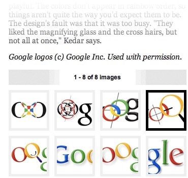
The Wired article about Google’s logo is split into eight pages, making it very difficult to read.

The Wired article about Google’s logo is split into eight pages, making it very difficult to read.


Don’t create barriers for your visitors


While this may seem like an easy way to squeeze more money from your ads, it poses two problems.  The first is that it’s just really, really annoying.  Having to load several pages just to read one article isn’t fun.  You’re creating an unnecessary barrier for your visitors, which could cause them to just click away.


The second reason has to do with Search Engine Optimization (SEO).  Search engines examine your page content to determine what it is about and then index it accordingly.  If your content is diluted by being split into several pages, each page makes less sense on its own and also holds fewer keywords about its topic. This probably would negatively affect the ranking of the article in search engine results.


Avoid Duplicate Page Titles


The title of each Web page is important. Page titles need to be unique for each page to improve your search results.  Often people create a generic title while working on their website’s template, then re-use the same title across the whole website.  This robs each page of several key benefits.


The first benefit is that a good title communicates to your visitors a lot of information about what the page is about.  People can quickly figure out if they’re in the right place or not.  Remember that this title doesn’t just show at the top of the browser window.  

The page title is also shown on the search engine results pages.  When people see a list of results on a search engine like Google, they read the page title to figure out what each page is about.  This is a good reason to spend a little time optimizing your page titles.


The second reason has to do with SEO.  Search engines need different information to rank the results of a particular query.  Your page title is an important piece of information used to gauge how relevant your page is to a particular search term.

This doesn’t mean you should load as many keywords as possible into the title.  Doing this defeats the first benefit, but you should ensure that each title succinctly describes the content of the page.  It’s also important that your page title includes a couple of words you think people will search for.


Here’s an example of a good page title. This is a Smashing Magazine page title as seen in Safari:


Here we have the title of the article, the category of the article and the name of the website

Here we have the title of the article, the category of the article and the name of the website. Putting the name of the website last puts more emphasis on what the page itself is about, rather than on website branding, which is still there.

And here’s how the page is displayed in a Google search result:


Google Smashing Magazine here’s how the page is displayed in a Google search result

Make Your Content Scannable


To ensure that your website is usable, you cannot only have a good design; you also need good copy.  Copy is a term used to describe all of the text content on a website.  Yes, good design will guide your visitors around the website, and focus their attention on the things that matter.  

It will also help them make sense of information chunks.  But your visitors will still need to read the text to process information.  This makes your copy an essential part of your overall website design.  Before you can write good copy, though, you need to understand how people will actually view your website.  

Don’t assume that your visitors will read everything from top to bottom.  That would certainly be great, but unfortunately, that’s not how it works.  The Web bombards people with information, and most of us try to consume as much of it as possible. This leads to very frantic browsing behavior causing us to jump from one piece of content to another, from one website to the next.

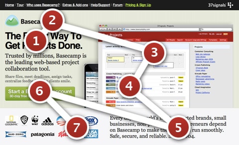
People tend not to read websites top to bottom; they start reading whatever pops out at them first and then move to the next thing that captures their interest.  The pattern may look a little like this:


Basecamp Landing Page To ensure that your website is usable, you cannot only have a good design; you also need good copy

The red circles indicate the areas where visitors tend to focus their gaze, and the numbers indicate the order in which they look at these elements.  Users dash from one interesting part of the page to another. To take advantage of this chaotic browsing pattern, you need to structure your copy a certain way.  Here are a few pointers:


  • Have several points of focus.  These are the parts of your page that attract the attention of visitors. This can be achieved by stronger, higher-contrast colors and larger fonts
  • Each focus point should ideally be accompanied by a descriptive heading.  Without reading the copy any further, visitors should be able to understand what this bit of content is about.  
  • Any other text should be short and easy to digest.  Provide just the essentials, and strip out the rest.  People will read bite-sized pieces of text but are put off by long paragraphs.


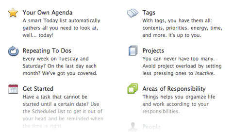
Things app’s features page splits up each feature into little bite-sized segments, each with its own icon and heading. This makes the list easy to scan

Things app’s features page splits up each feature into little bite-sized segments, each with its own icon and heading. This makes the list easy to scan. To make copy even more effective, list actual benefits rather than feature names.


Include Contact Information


User engagement is important if you want to build a successful community.  Building your community is important if you want to build successful websites and social Web apps.  User engagement is also important if you want to build loyal customers.

Quickly answering people’s questions and fixing their problems doesn’t just mean that you have good customer service.  It means you care, and your customers and visitors will appreciate it.


But many websites still don’t give visitors an easy channel for getting in touch with the company. Some websites don’t even have an email address or contact form on them.


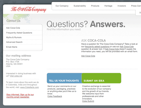
When you click on the contact link on the official Coca-Cola website, you’re presented with this page. It has no email or phone number

When you click on the contact link on the official Coca-Cola website, you’re presented with this page.  It has no email or phone number.  Most of the links lead to automated FAQs.  The feedback form requires your address and age and has a 500-character limit.  The “Submit an idea” form is two pages long, with terms and conditions attached.  It doesn’t look like Coca-Cola really wants you to contact them.


Sure, putting your email address on the Web will likely attract a lot of spam, but there are a couple of solutions.


Enkoder is my favorite solution for putting email addresses on the Web.  Enkoder is an application that comes in two flavors: a free one for Mac OS X, and another free one as a Web app.   It encrypts any email address that you give it and gives you a bunch of gibberish JavaScript code to place on your web page.  When the page with the code loads, your email magically appears as a clickable link.  Bots scouring for email addresses won’t be able to interpret the code.


You could also use contact forms to bypass the problem of showing your email address on a page.  You’re still likely to receive spam unless you put some good Captchas or other spam protection mechanism in place.  Keep in mind that things like Captchas are barriers to user interaction and will likely degrade the user experience.


Forums are a terrific alternative.  Online forums are a great communication channel that can be an alternative way for users to get in touch.  A public forum is better than a simple contact form or email because your customers can help each other on a forum.  Even if you don’t personally respond to a customer, another helpful customer may help that person out, solving his or her problem.


GetSatisfaction Acts as a Forum


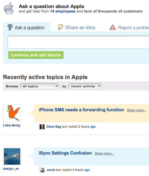
GetSatisfaction is a Web app that works like a forum.  Users can post their problems and feedback as topics on the board.  Customers and staff can respond to them.  Users can add comments to elaborate on their problem.

Whether you go with a hosted solution like GetSatisfaction or roll your own message board, a two-way communication channel like this is a great way to keep in touch with your customers.


GetSatisfaction is a Web app that works like a forum. Users can post their problems and feedback as topics on the board

The former GetSatisfaction forum for Apple.

Include Search Capability


A lot of people start looking for a search box as soon as they arrive on a page.  Perhaps they know exactly what they’re looking for and don’t want to spend time learning the website’s navigation structure.  Jakob Nielsen calls these people search-dominant users:


“Our usability studies show that more than half of all users are search-dominant, about a fifth of the users are link-dominant, and the rest exhibit mixed behavior.  The search-dominant users will usually go straight for the search button when they enter a website: they are not interested in looking around the site; they are task-focused and want to find specific information as fast as possible.”

Jakob Nielsen

Whether you run an online shop or blog, you need search.  People may come looking for a particular product or for an article they remember reading a while back, and chances are they’ll want to find it with a quick search.  The good news, if you haven’t already implemented search on your website, is that it’s very easy to do.

You don’t need to code your own search feature because search engines like Google and Yahoo have very likely already indexed most, if not all, of your website’s pages.  So all you need to do is pick the one you want to use and plug in a search box.


Functionality Should not Require Registration


Your website may have some content or features that require visitors to register before using.  That’s great, but be careful how much content is put behind this registration shield.  Very interactive Web applications, such as email, document editing, and project management, restrict 100% of their functionality to registered users.

Other websites, such as social news websites, do not.  I can browse all the stories on Digg and Reddit without having to log in.  Users do not have to identify themselves to enjoy some functionality.

When you implement a log-in barrier, be careful that you don’t lock away features that don’t really need user identification.  Some blogs require people to register before posting.  Sure, that will significantly decrease spam, but it will also significantly decrease the number of comments you see, too.

User participation on your website is affected by how many barriers there are.  Removing barriers such as registration will almost certainly increase user participation.  Once users start using your website, they will more likely sign up, because they’re already involved.


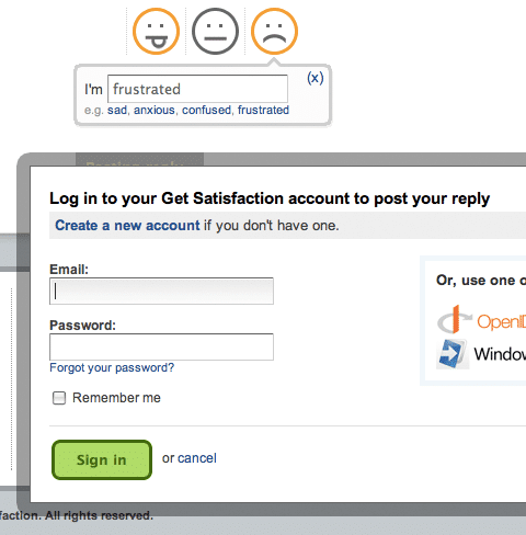
The former GetSatisfaction forum for Apple Login

The GetSatisfaction interface allows you to fill in your comment about a company or product and then click the “Post” button.  Instead of seeing your feedback posted, you’re greeted with an unexpected “Log in or register” message.  Not good, considering the customer may already be frustrated.


Remove Old Permalinks Pointing Nowhere


A permalink is a link to a page that isn’t meant to change, such as a link to a blog article such as the one you’re reading now.  Problems occur when a website moves to another domain or has its structure reorganized.  Old permalinks pointing to existing pages on the website become dead unless something is done about them.  That something is called a 301 redirect.


301 redirects are little instructions stored on your server that redirect visitors to appropriate pages.  If someone arrives on your website using an old link, they won’t see a 404 error page, “Page not found”.  Instead, the 301 redirect forwards them to the right location.  Provided that you’ve set it up correctly.  The number “301” designates the type of redirect that it is, permanent.


Whoops looks like we lost something 404 error

There are various ways to do 301 redirects.  How they’re implemented depends partly on the Web server you’re using.


Avoid Long Registration Forms


Registration forms are barriers.  They are barriers because it takes effort to fill them in, and the task itself is no fun.  People have to invest time and effort to register, and then they have to invest even more time and effort in the future to remember what user name and password they used.

We can shrink this barrier by making the sign-up form as short as possible. At the end of the day, the purpose of a registration system is simply to be able to identify each user; so, the only requirements are a unique identifier, such as a user name or email address, and a password. If you don’t need more information, don’t ask for it. Keep the form short.


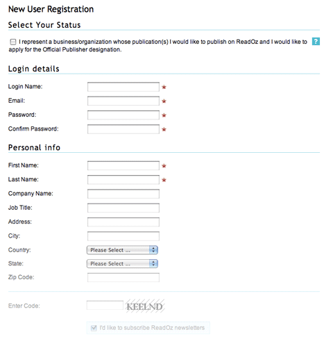
ReadOz Registration Form If you don’t need more information, don’t ask for it. Keep the form short.

The ReadOz sign-up form is very long.  On closer inspection, we find that half of the fields are optional.  If they’re optional, they don’t really need to be there.  Such a form would likely scare off a user seeing it for the first time.  Show only what the person needs to register; the rest can be filled in later.


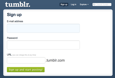
Tumblr has one of the shortest sign-up forms around. Just three fields: email, password and the URL of your new blog

Tumblr has one of the shortest sign-up forms around.  Just three fields: email, password and the URL of your new blog.


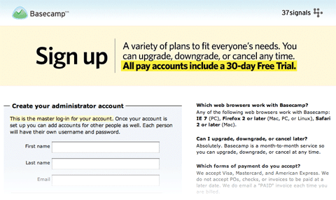
The Basecamp sign-up page has a smart trick. It has no website navigation aside from a home-page link. This keeps the user focused on the sign-up process

The Basecamp sign-up page has a smart trick.  It has no website navigation aside from a home-page link.  This keeps the user focused on the sign-up process, without any distractions or means of leaving the page.


Usability Should Make Things Easier


Usability is all about making things easier to use.  Less thinking, less frustration.  A website should do all the work and present visitors only with the things they’re looking for.


Usability is About User Experience


Usability is also about the experience people have using your website, so attention to detail matters, as does the presentation and feel of the page.


How Emotional Ads Work Best to Engage Your Customers *

How Emotional Ads Work Best to Engage Your Customers *

Emotional Ads Work Best to Engage Customers


Most of us understand that the ads which engage us emotionally work better than those that don’t.  I could hear many marketers utter a simultaneous “duhhhh!” when they read that.

You might find it surprising that many business owners still don’t believe that they are swayed by messages that speak to their emotions when making purchase decisions.  These individuals continue to believe that buying is driven by facts.

For these super-rational decision makers lets look at some hard data….


How Brands Survive and Grow


I was discussing the book Brand Immortality by Pringle and Field with some colleagues earlier this month.  An interesting finding from that book that I’ll share with you is an analysis of data from the IPA.  This is the UK-based Institute of Practitioners in Advertising.

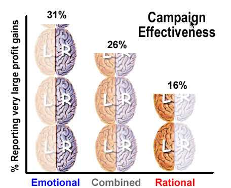
Included in the IPA dataBANK are over 1400 case studies of successful advertising campaigns submitted for the IPA Effectiveness Award competition over the last three decades.  This analysis of the IPA data gauged the increased profitability of ad campaigns using emotional ads compared to using rational ads and using information to increase profits.  The chart below compares the campaign results.


Advertising campaign profit gains chart showing emotional 31%, combined 26% and rational 16% increse in profitability

Analyzing the existing data, it was discovered that campaigns with purely emotional content outperformed those with purely rational content by nearly 2 to 1.  They found the gap of to be 31% vs. 16% in favor of emotion based ad campaigns.

They took it a step further and compared emotion based campaigns to those that mixed emotional and rational content.  Purely emotional campaigns still out performed these by 31% vs 26%.


Our Minds Process Emotions Unconciously


Why do ad campaigns based on emotions work better?  Pringle and Field attribute these results to how our brain’s process emotional input.  Our mind’s do this without conscience processing by us.

The authors do note that using an emotional marketing campaign may be more effective.  The downside is that it’s not easy to create ads that effectively engage consumer emotions.  However it’s is pretty simple to base a campaign on an “actual killer advantage”.

If you conduct an emotional campaign that is not based in reality, your brand can suffer actual damage to it’s reputation.  Pringle and Field suggest that an emotional branding approach be “hard-wired into the fabric of the brand.”

This requires a major commitment as well as a good understanding of consumer motivation.  They cite Nike’s overall theme of “success in sport” as an example of a brand that focuses on a key emotional driver and builds advertising, sponsorships, etc. around it.


Market Leaders Dominate Emotional Branding


Pringle and Field note, smaller brands can’t successfully follow the same emotional branding approach as the market leaders.  However you may be able to segment your marketing and find a group of consumers that will respond to their unique appeal.

Ben & Jerry’s and Jones Soda, for example, aren’t the biggest players in their fields, but they have achieved success by appealing to smaller consumer segments.


Small Businesses Face Unique Challenges


Smaller brands do face additional challenges.  Their brand name recognition is likely lower.  An emotion-based campaign may confuse consumers who don’t connect the brand and product category.

Budweiser can run amusing and engaging commercials about Clydesdales and Dalmatians because 100% of the audience knows their products.  A small business might have to take a “combined” rational and emotional approach even if it is slightly less effective.  Or their emotion-based ads must clearly identify their product.

Emotion-based ads may be more difficult to create, but statistics tell us that it’s worth the effort.


Ask Questions on Your Facebook Page to Get More Comments *

Ask Questions on Your Facebook Page to Get More Comments *

How Asking Questions on Facebook Gets More Comments


As a business owner, I hope you have made the choice to build a Facebook presence for your business.  It makes sense if you want to reach your target audience, engaging them and making a lasting connection.

It’s becoming increasingly difficult to grow your audience using Facebook.  Especially if you don’t have the budget to boost posts or advertise.

However, you can still use Facebook effectively without spending any money.  The most important thing that you do is to increase engagement with your existing followers.  Doing this also prompts Facebook to show your posts more widely.

Do your visitors engage with you on Facebook?


Asking questions on your Facebook Page gets more comments

Social Media Engagement Matters


As well as signaling to Facebook that people like what you’re posting, high levels of visitor engagement also means that:

  • your readers will believe that you’re interested in them, and that you want to build a relationship with them
  • you’ll build social proof.  If someone discovers your Facebook page and sees you’re engaging with your visitors, they’re more likely to want to join in.


There are several different types of engagement, including:

  • People liking your Facebook page.
  • People reacting to your updates on Facebook.
  • People sharing your posts on their page or group.
  • People commenting on your posts.


The engagement I like best is when visitors comment on your posts.  When readers leave comments, it gives you an opportunity to learn about them.  They’re not just going for the easy option of clicking “like”.  They’re putting themselves out there and responding to your post.

This article is all about getting more comments on your Facebook page.  The most effective way I’ve found to do that on any medium, is to ask questions.

That sounds pretty obvious, right?  I’m amazed how many of the pages I follow never ask questions.  They never take the opportunity to get me commenting and engaging with them.

If you want to grow an audience of people who feel like they know, like and trust you, then you need to ask questions.  But not just any questions.  You need to ask the right types of questions.


Nine Types of Question You Can Ask On Your Facebook Page

Ask A “Biggest Problems” Question


It may seem negative asking your readers to share their biggest problems, challenges, obstacles or even fears.  However, you’ll be surprised by the honest responses that come out in the discussion.

You can even ask fairly specific things.  On a parenting page there might be questions such as:

  • What’s your biggest fear as a parent?
  • What’s your biggest challenge raising boys?
  • What’s the biggest problem you have in the area of discipline?


These types of questions help you understand your pages followers.  The reponses can also help you choose future content topics for your blog.

You may also find people mentioning problems you’ve written about in past articles or posts.  You can engage them and say, “Here’s an article with some tips on how to overcome that challenge”, driving people back to your archives.


Ask A “Question from a Reader”


This is a technique commonly used by my friend Samantha Jockel from School Mum.  She’ll often write a post like this:


Her questions which always start with “A School Mum asks” are sometimes funny, sometimes start debates, and sometimes offer a way in to more controversial topics.  And they often get a lot of comments.

If you don’t have any questions from readers, you might be able to create some by digging into:

  • comments on your blog
  • comments left on your Facebook page
  • emails you’ve received.


Ask A “Share a Photo” Question


While this won’t work for every type of site, however asking your readers to share a photo or video can be relevant to many Facebook pages.

This could work on many types of blogs.  Here are some I’ve seen.

  • Parenting blogger – “Show us a favorite piece of your kids art.”
  • Food blogger – “Show us the most recent picture of food on your phone.”
  • Travel blogger – “Show us your favorite beach.”
  • Fashion blogger – “Show us your favorite pair of shoes.”
  • Technology blogger – “Show us what you have in your laptop bag.”


You may not get as many comments as you would with other types of questions.  But you’ll probably get some really interesting ones.


Ask A “This vs That” Question


With this type of question, you get your followers to choose one of two options.  It might be something like “Are you a dog or a cat person?”

You can also use this for a yes/no question such as, “Do you exercise daily? Yes or no”.

Be careful if your question is likely to spark a lively debate.  We don’t ask about certain types of topics because the conversation can end up getting a bit negative.


Ask A “What are Your Dreams” Question


Ask your followers about their dreams and aspirations.  It helps you understand not only what your readers are going through right now, but also what they want to do or become.

This gives you another opportunity to use your readers’ responses to create content that helps them move toward the dreams they have.

People love to tell others about their dreams, ambitions and hopes for their future.  This type of question often receives a lot of well thought out comments.


Ask An “Accountability” Question


You’ll find this type of question used in a lot of Facebook groups.  They will often ask things like, “What’s your biggest goal of the week?” or “What do you want to achieve this week?”

This can be a great way to get engagement because it gives you the opportunity to respond to readers later in the week.

I left a comment on a post like this on Monday.  On the Friday the blogger left a reply to every single comment that mentioned a goal, asking, “What did you achieve…?”

I hadn’t reached my goal.  However I got it done ten minutes after he left that comment.  I was really grateful that blogger took the time to keep me accountable.  And I’ll be going back to that page.

If your page involves people trying to build a habit, learn something or become something, you could ask this type of question and then come back to encourage them and help build some accountability.


Ask A “Fill in the Blank” Question


This is a really easy and effective) type of question to ask.

For a blog such as Better Business Alliance I might ask:

My first blogging platform was __________.

And for a food blog you might ask something like:

The word that describes my diet is ____________.

or

My favorite comfort food is _______________.


The beauty of this type of question is that it’s incredibly simple for someone to answer.  They just have to leave one word.

Asking a “fill in the blank” question is often a good way to get someone to leave their first comment.  This is especially true if they’ve been following your page for a while without commenting.


Ask A “Question About a Blog Post”


When you share a link to a blog post you’ve written, you can add a question.  This will often encourage readers to read your post as well as comment.

For instance, one post I shared a while back on Better Business Alliance was “5 Steps to Developing Your Unique Selling Proposition”.

As well as posting the link to Facebook (which automatically pulled in the title and image from the post), I added a question: “Why You Need to Develop a Unique Selling Proposition?”

My goal was to get people reading that blog post.  But I also got lots of people answering the question.  We don’t normally get many comments on our links to blog posts, but in this case 3 people answered the question.  That particular Facebook post also had a higher-than-average reach.

Hopefully you’ve already tried some of these types of questions on your Facebook page.  The key is to get into the habit of asking questions regularly, and mixing up the types of questions you use.


Ask A “What are Your Tips” Question


Although people are coming to your Facebook page to learn from you, in any community there’s a lot of collective wisdom.

With this type of question you can say, “I want to hear from you today with your tips” about a particular area.

You may not get as many responses to this type of question as you would to a “fill in the blanks” question. But the responses will be deeper, longer, and more useful. They’ll be valuable both to you and your other readers.

And if you get permission from those who comment which you can do by mentioning how you plan to use some responses as future blog post topics.  Just be sure you give credit to the people who left those comments.


Final Tips for Using Questions on Your Facebook Page


You need to keep some things to keep in mind when asking questions on your Facebook page.


Ask what,who, where, when, how, and why questions on Social Media to get more comments

Always Stay On Topic


Make sure your questions relate to your topic.  Occasional off-topic questions can help build engagement, but don’t do it too regularly.  Your readers may feel that your page topic is getting lost.


Don’t Ask Too Many Questions


Mix up the types of post that you publish.  Share links, videos, pictures, and so on as well as questions.  Facebook seems to prefer this, and it’s likely to be better for reader engagement too.


Consider Using Facebook Live


Facebook Lives get more reach than other types of post.  So you may want to go on Facebook live and ask your readers a question.  Once your live video is over, it will appear in people’s Facebook feeds as a replay.


Be Specific With Your Questions


Don’t be too open ended with your questions.  You’re likely to get much better responses if your questions are focused.  You want to make it as easy as possible for people to comment.  If your questions are too open ended they may not understand how to respond.


Consider Using an Image


Using an image helps your question stand out in people’s newsfeeds.  It could be a plain image, or an image that includes your question text.  Spending a minute or two doing this could boost your engagement.


Be as Responsive As You Can Be


If people answer your question, they should get a response from you.  They’ve taken the time to respond to you, so take some time to respond to them.  That doesn’t always need to be with a comment.  You might use a “like” or other response, particularly if they left a “yes”/“no” or single-word comment.


Asking questions gets visitors to comment and provide answers

Will You Adopt an Asking Questions Mindset?


I hope this helps you come up with lots of ideas for questions you could ask on your Facebook page to build engagement.  Of course, you don’t have to limit your use of questions to Facebook pages.

You can use questions in Facebook groups, LinkedIn groups, on Twitter, or even on your blog.  Let me know if my article has given you an asking questions mindset?  Are your questions getting more comments from your visitors?


How to Make Your Email Awesome With Great Digital Marketing *

How to Make Your Email Awesome With Great Digital Marketing *

5 Ways to Make Your Email More Awesome


Let’s begin by saying that email marketing hasn’t changed much in the past 20 years.  However even in 2019, tremendous opportunities still exist to improve your email marketing results.  A late 2018 Email Marketing Industry Report from Emma’s found that 25% of marketers plan to increase their email spending.

The five methods we discuss here will help you reach your potential for customer engagement through the use of your email list.


The best digital marketers consider their email list to be their digital nerve center.

Make Email Your Digital Nerve Center


There are so many things about Digital Marketing which you are unable to control.  Search engine algorithms are constantly updated and frequently change.   Social Media purveyors also are constantly changing their rules and methods and can even fall out of favor with your customers.

Your email list never changes and it is always yours.   You can leverage your email list to improve your ad targeting on paid social media networks.  The best digital marketers, consider their email list to be their digital nerve center.


Email marketing is still is the most flexible, most dynamic way to reach your customers.

Personalize and Micro-target Your Emails


Surveys show that 59% of marketers say that email marketing delivers the best return of investment.  Having 6 out of 10 endorse a specific marketing tactic is significant and can’t be ignored.  To be more productive using your email list, other digital marketing tactics come into play.

Social media marketing has changed a lot in the last couple years.  I believe most would now agree that the use of social media is now largely an advertising tactic as opposed to an organic reach tactic.

Email marketing is still is the most flexible, most dynamic way to reach your customers.  When we discuss ad targeting, whether it’s display ads, programmatic ads, social media ads, email opt-ins, email behavior, clicks, opens, etc., can be used to dramatically improve your ad targeting.

If you want to be better at your ads, the best way to do this is to be better with your email and mine your email data.  Roll everything back into your advertising and turn it into a one plus one equals three situation.


Get Better Results


By personalizing and micro-targeting your email marketing content the results will be more robust and relevant to the recipients and you will reap the benefits from doing so.  That’s why your email list data is so important in deciding who you contact and what they are most likely to respond to.

The people on your email list know you and have asked to hear from you.  They open your content.  They want your content while everyone other door you’re knocking on, you’re trying to get them to allow you to enter.  Your email list is people who have already invited you into their homes.


Boost Authenticity with Personalization


Every business is just a collection of people, and we trust people more than we trust businesses.  Our trust in people over businesses is growing and becoming more true.


User Generated Content Lends Credibility


In the Instagram age, we can use User-generated content is often used to provide interesting, trust-worthy images and content to humanize your emails and persuade your subscribers to take action.

The more personal and trustworthy your emails are, the better your results will be.  By using names and being specific in your emails making them personal and human, you make them relatable and memorable. This simple step will certainly get a much higher response rate than an email which is impersonal and generic.


Email is one of the most testable forms of marketing

Always Test Your Emails


The fourth way to make your email more awesome is to test, test, and test.  Email is one of the most testable forms of marketing.  If you’re sending emails, you should be testing.  But where do you begin?

Only 11% of email marketers today always at least A/B test their email, so about 1 out of 10.  Testing isn’t that complicated to do.  We should always be testing and that we should never send an email without a test included.


Email Results are Testable


Sometimes that doesn’t work.  But that’s probably the optimal idea.  Email is, in my estimation, the most testable form of marketing ever devised.  Email data is the easiest to track.  At some point in this age of artificial intelligence and machine learning, testing will no longer be optional.


Study Benchmarks, Then Ignore Them


The fifth way to make your email more awesome is to examine benchmarks, and then ignore them.  There are more email benchmark data than any other kind of marketing benchmark data.  However, benchmarks will only tell you so much, and if all your care about is averages, you’ll always be an average marketer.

All of the email services publish similar email data.  A simple Google search will find the average email open rate, average click-through rate, average click to open rate according to different industry types.  If all you care about is averages, you will never be anything other than an average marketer.


Make Your Email Unique


To truly stand out you have to do something different with your email.  The best tests that you can perform pit something normal against something which is not normal.  Not a small change, but a major change.  It’s amazing how often really unusual emails work because they break out of the box that most email marketers build around themselves.


Success is Much More Than an Email List


Let’s first examine how you can grow your email list beyond a typical signup form.  There are several different strategies that we’ve used successfully.  One is social media.  We’ve had some success with both paid and organic social media.

Using different engaging content, putting that out there on social media with a link to a signup form because everything ends at the signup form.  Because we always end up using a signup form, there are different ways to drive people to your signup form.  You can also use referral bonuses.


Practice Email List Hygiene


Email list hygiene is an important point to consider.  It’s not the size of your list that matters, you’re better to have a smaller engaged list.  This matters not only for results, but also from n email delivery point of view.

Email delivery systems will look at your open rate.  Partly to make decisions about how your email is treated.  The higher you keep your open rate, the better your email will be treated.


Re-engagement Emails can Revitalize Your List


If your emails have gone unopened, it may be time to send a re-engagement email.  The re-engagement email simply questions whether someone who has not been responsive would like to continue receiving your emails.

This email acknowledges their inactivity and asks them to verify that they want to stay on your email list or take an action that gives you new information.  This engagement helps you to improve the relevancy of what you are sending to them.


Over 50% of our emails are opened on a phone

Don’t Forget Mobile Technology


A final point I would like to make is that over 50% of our emails are opened on a phone.  I would encourage everyone to design emails that work well on mobile platforms.

We’ve reached the point where we probably should be designing for phones and then adapt them to tablets, laptops and desktop computers.


Accessibility Toolbar