
Learn How to Avoid These 11 Website Design Mistakes *
11 Common Web Design Blunders to Avoid
You have to wonder, with all the websites on the Internet, and hundreds if not thousands more created every day. What does it take to create a good website?
Building a website can be difficult itself, but the bigger challenge is making it usable. Too may web designers forget, they created their website to solve the users’ needs. Often, their creativity has priority over web practicality and usability.
Here we will highlight 11 web design blunders that web developers and designers make. We also will make some suggestions on how these mistakes can be easily avoided.
Include a Search Box
The web is a huge archive of information. It doesn’t matter if it’s a corporate website or a mere blog, a search box is essential to every website. Your visitor might be looking for something that is hidden within your website. If you have a search box, visitors will be able to find what they are looking for.
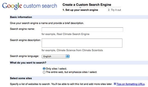
Google Custom Search is a neat, simple and effective way to get started. Google Custom Search enables your visitors to search your site efficiently. All you need to do is simply copy the HTML code from the control panel and paste it on your website and voila, you’ve got a search function right on your website.
For More Information Visit:
Designing The Holy Search Box: Examples And Best Practices – This article has detailed guidelines to help you design your custom search box.
Make it Readable and Legible.
This is a crucially important element of web design. A good design grab’s your visitors’ attention. However, your users have to read text to be able grasp the information they desire. Don’t choose bizarre font styles and sizes that make reading your content almost impossible.
There are simple things that you can do to improve the users’ reading experience on your website.
- Compare color schemes of most major sites and notice how the colors improve readability. A good place to try out different color schemes is Adobe Kuler.
- Use a font like Sans serif typeface which allows for easy reading on the web.
Readability Suggestion:
This is a great article which gives you more tips on improving your website readability – Readability – Making Web Pages Easy To Read.
Organize Your Content.
A website’s content is what drives traffic to it. How your content is structured, ensures it’s success or failure. Users do not read unless it is absolutely necessary. Your visitors like to scan through information and pick out points of interest on a web page.
Don’t just put a block of text on your web page and neglect headings, sub-headings, bullets, keywords, paragraphs, etc. Use appropriate page titles for each web page so users know exactly where they are. Some designers even neglect naming their web pages.
The worst blunder would be putting inaccurate, inaccessible, insignificant or out-of-date content on your website. Your content must sync with the overall theme of the website and be useful. If a page is under construction, why bother putting it up? If a designer really must, then it is only temporary and 3 weeks will no longer be deemed temporary.
Content Organization Suggestions:
Organize the content on your website using HTML and CSS when creating the design of your pages.
- Create enough whitespace between your text and images by using margins.
- Update and be consistent. The purpose of updating is not just to add new content but to spot and correct past mistakes.
Site Navigation Matters.
Navigation within your website needs to be seamless. Your visitors should be able to easily find their way around your content. There is no standard for navigation within a website. However, as new web development technologies emerge, it’s important to make your site navigation intuitive and consistent.
If you use text as navigation, it must be concise. Visual metaphors should not be re-invented. If hyperlinks are used, they should stand out from the rest of your text. Dead links need to be avoided. Dead links increase user confusion and wastes their time.
Navigation Suggestions:
- Make your navigation smooth by using textual descriptions for all links. Provide alt text for images. Use alternative text description techniques for Flash or Javascript links.
- Organize and structure your navigation in tandem with the theme of the website. Personal websites can afford to be more creative yet accessible but a business website requires more efficiency and clarity.
Remember, if users can’t find what they want in less than 3 clicks, most will leave your site immediately.
For More Information About Site Navigation: Implementing Effective Website Navigation – This article gives more insight on implementing an effective navigation for your website.
Embrace Consistent Design.
Don’t use excessive creativity in your website design. Be consistent with your design choices on every web page in your website. Users’ find this both comforting and easier to understand.
No matter how outstanding and attractive a website is, if the overall look and feel is not consistent, users can’t relate to it and feel less comfortable.
Design Suggestions:
- Use a consistent template for every page with links to the main sections of the site.
- Create aesthetically simple designs and users will never get confused on your website.
Choose Screen Resolution Carefully.
I’m sure you’ve visited websites where you have to scroll horizontally. This is an absolute no-no in modern web design. A good designer will develop websites that fit on most screen sizes. The current optimized layout for websites currently is 1024 x 768 pixels.
Screen Resolution Suggestions:
It’s almost impossible for your design to fit every resolution. Especially when visitors are now surfing from mobile phones and netbooks. However, but we can get a good idea what are the generally used screen resolutions using the following methods:
- Check your stats – Analyic services like Google Analytics provides you information about what monitor resolution they are using. These are useful information you should know before initiating your next revamp.
- W3 Schools Browser Stats – W3 Schools gives clear lists of the most popular browser used by netizens and sort them according to popularity. There are other interesting and important statistics too.
Simplify Registration Forms.
Registration forms shouldn’t be tricky. How much information do you require from your user? Users shouldn’t need to enter a lot of details to register on your website.
Websites which choose to make many registration fields mandatory often frustrate users very quickly. Always remember, users visit a website to acquire information. Not the other way round.

Someecard‘s simple form makes registration painless.
Registration Form Suggestions:
Compare registration forms across communities on the web and understand what basic information is required of the user during the registration process.
More Design Usability Information: 9 Common Usability Mistakes In Web Design – This post on Smashing Magazine takes an in-depth look at registration forms and other usability mistakes.
Overuse of Images/Animations.
Too much images on a web page is a huge turn off. Images can be used to capture users’ attention but it can also be a distraction or just aggravating. Images should be used to illustrate and guide the user where appropriate.
Animations are awesome and a powerful medium. Especially when used appropriately. When it’s a cycle or just too much on a web page, it gets on the users’ nerves. Users don’t have the patience, time or resources so designers must offer alternatives or better yet, the skip button, if it’s a full page animation.
More Image Information: Flash: 99% Bad – Use Flash appropriately. It’s been almost 10 years since Jakob Nielsen published this article but it’s still relevant in terms of Flash usability especially the Breaks Web Fundamentals piece.
Include More Whitespace.
Too many designers forget about whitespace on webpages and how important it is. Too often designers become so invested in their design creativity that they forget that it’s not about them. They make the mistake of cramming too much information onto a single page. This results in a cluttered and unreadable page.
Here are some articles showing the importance of whitespace in web design:
No Background Music.
Users don’t want cool, they seek efficiency. 99 percent of your visitors don’t care about the music on your website. Some designers make it worse by putting different background music on every web page.
Background Music Suggestion:
Don’t use background music, but if you must, create a frame for the code and user controls. That way, the music loops continuously, instead of changing each time a new page is loaded within the website. And the user can stop or pause whenever.
Test, and Test Some More.
How many times have we been to web pages that can only be viewed on a certain browser? Web developers have to have a checklist of sorts when testing websites.
- Can the website be viewed in different environments?
- Is the design layout consistent in all browsers?
- Can the website be viewed in different settings such as Images turned off, JavaScript turned off, etc?
Browser Suggestions:
W3C offers tools to test for quality assurance. Check out W3C Quality Assurance Toolbox and Web Page Validation.